Newsletter


This element allows inserting newsletter in content.
| Param Name | Description | |
|---|---|---|
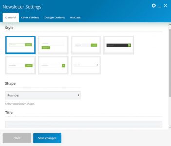
| Style | Select the newsletter style. There are seven styles. | |
| Shape | Select newsletter shape. Note: This section only visible for style-1 to style-5. | |
| Button Position | Select the newsletter button position. Note: This section only visible for style-4 and style-5. | |
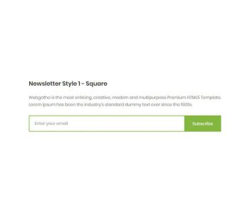
| Title | Enter the title. | |
| Description | Enter description. Please ensure to add short content. | |
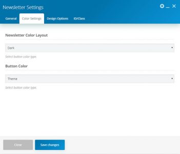
| Color Settings | ||
| Newsletter Color Layout | Select the button color type. | |
| Button Color | Select the button color type. There are three color types as Theme, Dark, and Custom. | |
| Button Color (Custom) | ||
| Text Color | Select Button Text color. | |
| Button Background Color | Select the Button background color. | |
| Button Background Color (Secondary) | Select the secondary background color will create a gradient effect. | |
| Text Hover Color | Select Button Text hover color. | |
| Button Background Hover Color | Select Button background hover color. | |
| Button Background Hover Color (Secondary) | Select the secondary background hover color will create a gradient effect. | |
| Icon | Note: This section only visible for the style-4, style-6 and style-7 | |
| Icon Library | Select icon library. | |
| Icon | Select an icon from the library. | |

