Slider
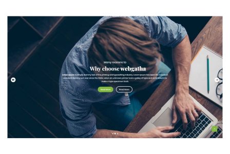
This element allows inserting Slider in content.
| Param Name | Description | |
|---|---|---|
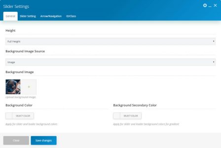
| Height | Select height for the slider as Full Height or Custom Height. | |
| Height (Custom Height) | ||
| Custom Height Value | Enter responsive slider height. | |
| Unit | Select unit for slider height | |
| Background Image Source | Select background image source as Image or External Link. | |
| Background Image Source (Image) | ||
| Background Image | Upload background image. | |
| Background Image Source (External Link) | ||
| Background Image Link | Please enter image external link | |
| Background Color | Apply for slider and loader background colors | |
| Background Secondary Color | Apply for slider and loader background colors for a gradient | |
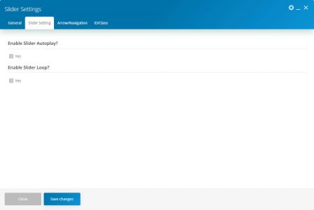
| Slider Setting | ||
| Enable Slider Autoplay? | Select this checkbox to enable slider autoplay. | |
| Enable Slider Autoplay? (Checked) | ||
| Interval | The interval between slides. In milliseconds. Default: 5000 | |
| Enable Slider Loop? | Select this checkbox to enable the slider loop. | |
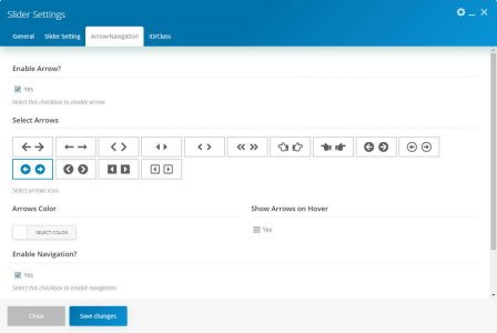
| Arrow/Navigation | ||
| Enable Arrow? | Select this checkbox to enable an arrow. | |
| Enable Arrow? (Checked) | ||
| Select Arrows | Select the arrows icon. | |
| Arrows Color | Select arrows color. | |
| Show Arrows on Hover | Select this checkbox to show arrows on hover. | |
| Enable Navigation? | Select this checkbox to enable navigation. | |
| Enable Navigation? (Checked) | ||
| Navigation Color | Select navigation color. | |
| Show navigation on Hover | Select this checkbox to show navigation on hover. | |
Slider Item.
| Param Name | Description | |
|---|---|---|
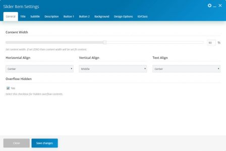
| Content Width | Set content width. If set ZERO than content width will be set fit content. | |
| Horizontal Align | Enter responsive slider height. | |
| Vertical Align | Select vertical align for slider. | |
| Text Align | Select the text-align. | |
| Overflow Hidden | Select this checkbox for hidden overflow contents. | |
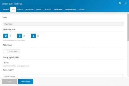
| Title | ||
| Title | Enter Title. | |
| Title Font Size | Enter responsive font size in pixel. | |
| Title Color | Select the title color. | |
| Use Google fonts | Select this checkbox to use Google fonts for title. | |
| Font Family | Select the Google font family for the title. | |
| Font style | Select Google font style for title. Note: These fields are only visible if “Use Google fonts” is checked. |
|
| Animation Style for Title | Select animation style for title. | |
| Animation Duration | Default 500ms. Write the number in ms. | |
| Animation Delay | Write the number in ms. | |
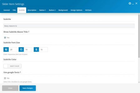
| Subtitle | ||
| Subtitle | Enter subtitle. | |
| Show Subtitle Above Title | Select this checkbox to show the subtitle above the title. | |
| Subtitle Font Size | Enter responsive font size in pixel. | |
| Subtitle Color | Select subtitle color. | |
| Use Google fonts | Select this checkbox to use Google fonts for subtitles. | |
| Font Family | Select the Google font family for subtitles. | |
| Font style | Select Google font style for subtitles. Note: These fields are only visible if “Use Google fonts” is checked. |
|
| Animation Style for Subtitle | Select the animation style for subtitles. | |
| Animation Duration | Enter animation duration for subtitle. Default 500ms. Write number in ms. | |
| Animation Delay | Enter animation delay for subtitles. Write the number in ms. | |
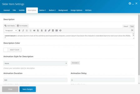
| Description | ||
| Description | Enter description. | |
| Description Color | Select description color. | |
| Animation Style for Description | Select the animation style for description. | |
| Animation Duration | Enter animation duration for description. Default 500ms. Write the number in ms. | |
| Animation Delay | Enter animation delay for description. Write the number in ms. | |
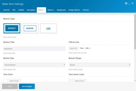
| Button 1 | ||
| Button Type | Select the button type. | |
| Button Title | Enter the button title. | |
| Title & Link | Enter the button title and link. | |
| Button Size | Select button size. | |
| Button Shape | Enter the button shape. | |
| Text Color | Select the button text color. | |
| Text Hover Color | Select the button text hovers color. | |
| Background Color | Enter the background color. | |
| Background Hover Color | Select background hover color. | |
| Animation Style | Select the animation style for the button. | |
| Animation Duration | Enter the animation duration for the button. Default 500ms. Write a number in ms. | |
| Animation Delay | Enter the animation-delay for the button. Write a number in ms. | |
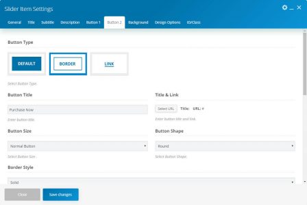
| Button 2 | ||
| Button Type | Select the button type. | |
| Button Title | Enter the button title. | |
| Title & Link | Enter the button title and link. | |
| Button Size | Select button size. | |
| Button Shape | Enter the button shape. | |
| Text Color | Select the button text color. | |
| Text Hover Color | Select the button text hovers color. | |
| Background Color | Enter the background color. | |
| Background Hover Color | Select background hover color. | |
| Animation Style | Select the animation style for the button. | |
| Animation Duration | Enter the animation duration for the button. Default 500ms. Write the number in ms. | |
| Animation Delay | Enter the animation-delay for the button. Write a number in ms. | |
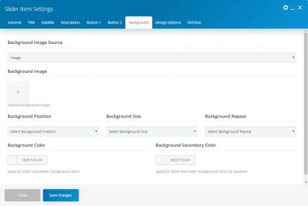
| Background | ||
| Image Source | Select image source. | |
| Image source( Image ) | ||
| Background Image | Set background image. | |
| Image source( External Link ) | ||
| Background Image Link | Enter the image link. | |
| Background Position | Select background-position. | |
| Background Size | Select the background size. | |
| Background Repeat | Select background-repeat. | |
| Background Color | Apply for slider and loader background colors. | |
| Background Secondary Color | Apply for slider and loader background colors for gradient. | |

