Flipbox
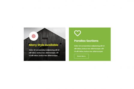
This element allows inserting Flipbox in content.
| Param Name | Description | |
|---|---|---|
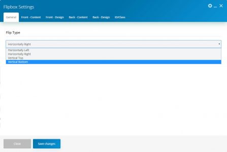
| Flip Type | Select flip style. There are four styles. | |
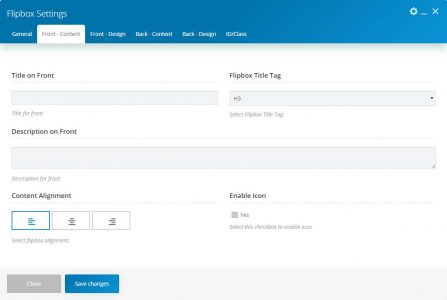
| Front Content | ||
| Title on Front | Enter content title. | |
| Flipbox Title Tag | Select the title tag from the list. | |
| Description on Front | Enter description contents. | |
| Content Alignment | Select content alignment as left, center or right. | |
| Enable Icon | Enable/Disable icon. | |
| Enable Icon (Enable) | ||
| Icon | Select icon source as font/image. | |
| Icon Library | Select icon library. | |
| Icon | Select an icon from the library. | |
| Icon Type | Select icon type as default, flat or border. | |
| Icon Size | Select icon size as small, medium, large or extra large. | |
| Icon Background Type | Select icon shape as round, rounded or square. Note: This option will only work for icon type as “flat” | |
| Icon (Image) | ||
| Icon Image | Upload/select icon image. | |
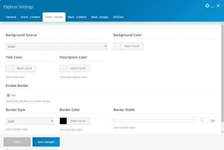
| Front Design | ||
| Background Source | Select the background source as color or image. | |
| Background Source (Color) | ||
| Background Color | Select the background color. | |
| Background Source (Image) | ||
| Background Image | Select the background image. | |
| Background Overlay Color | Select the background overlay color. | |
| Icon Color | Select icon color. | |
| Icon Background Color | Select icon background color. | |
| Icon Border Color | Select icon border color. | |
| Title Color | Select icon title color. | |
| Description Color | Select icon description color. | |
| Enable Border | Enable/Disabled border on flipbox. | |
| Enable Border (Enable) | ||
| Border Style | Select border style from list. | |
| Border Color | Select border color. | |
| Border Width | Set border width. | |
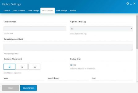
| Back Content | ||
| Title on Back | Enter the content title. | |
| Flipbox Title Tag | Select the title tag from the list. | |
| Description on Back | Enter description contents. | |
| Content Alignment | Select content alignment as left, center or right. | |
| Enable Icon | Enable/Disable icon. | |
| Enable Icon (Enable) | ||
| Icon | Select icon source as font/image. | |
| Icon Library | Select icon library. | |
| Icon | Select an icon from the library. | |
| Icon Type | Select icon type as default, flat or border. | |
| Icon Size | Select icon size as small, medium, large or extra large. | |
| Icon Background Type | Select icon shape as round, rounded or square. Note: This option will only work for icon type as “flat” | |
| Icon (Image) | ||
| Icon Image | Upload/select icon image. | |
| Read More? | Enable/Disable read more button. | |
| Read More (Enable) | ||
| Read More type | Select button type as default, border or link. | |
| Read More Title | Enter read more button text. | |
| Read More Title & Link | Enter the button title and link. | |
| Button Shape | Select button shape from the list as square, round or rounded. | |
| Button Text Color | Select button text color. | |
| Button Background Color | Select the button background color. | |
| Button Border Color | Select the button border color. | |
| Button Text Hover Color | Select button hover text color. | |
| Button Background Hover Color | Select the button hover background color. | |
| Button Border Hover Color | Select button hover border color. | |
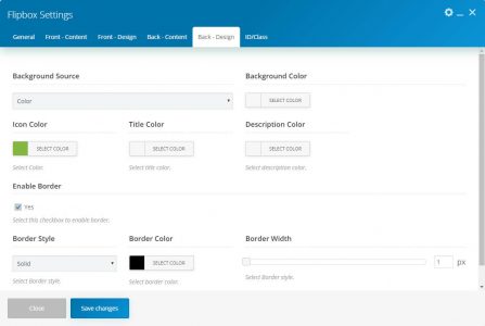
| Front Design | ||
| Background Source | Select the background source as color or image. | |
| Background Source (Color) | ||
| Background Color | Select the background color. | |
| Background Source (Image) | ||
| Background Image | Select the background image. | |
| Background Overlay Color | Select the background overlay color. | |
| Icon Color | Select icon color. | |
| Icon Background Color | Select icon background color. | |
| Icon Border Color | Select icon border color. | |
| Title Color | Select icon title color. | |
| Description Color | Select icon description color. | |
| Enable Border | Enable/Disabled border on flipbox. | |
| Enable Border (Enable) | ||
| Border Style | Select border style from list. | |
| Border Color | Select border color. | |
| Border Width | Set border width. | |

