Banner
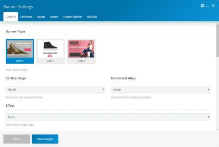
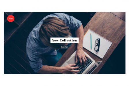
This element allows inserting the banner in content.
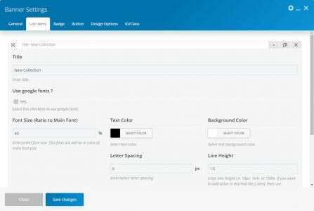
TitleAdd banner text here. Use Google font to select this checkbox to use Google fonts. Font FamilySelect Google font family. Font style selects Google font style.
Note: These fields are only visible if “Use Google fonts” is checked.Font SizeEnter/select font size. This font-size will be in the ratio of the main font-size. Text ColorSelect text color.Background ColorSelect text background color.Font style select font style.
Note: This field only visible if “Use Google fonts” is unchecked.Font WeightSelect font-weight.
Note: These fields only visible if “Use Google fonts” is unchecked.Text TransformSelect text-transform.Letter SpacingEnter/select letter spacing.Line HeightEnter line-height. If you want to add value in decimal, then use a full decimal format like allowed units are px, em, and %.ResponsiveSelect checkbox(es) to show/hide text on specific device size.
| Name | Description | |
|---|---|---|
| Banner Type | Choose a banner style. There are three styles, and each style contains specific parameters. | |
| Vertical Align | Set banner text vertical position. | |
| Horizontal Align | Set banner text horizontal position. | |
| Effect | Select the banner effect type. | |
| Banner Padding | You can set the banner padding here. | |
| Font Size Responsive | Select this checkbox to enable responsive font size for different width. | |
| Font Size | Enter the Font Size | |
| Font Size Responsive (Yes) | ||
| Extra Large Devices (≥1200px) | Enter the Font Size for extra-large devices. | |
| Large Devices (≥992px) | Enter the Font Size for large devices. | |
| Medium Devices (≥768px) | Enter the Font Size for medium devices. | |
| Small Devices (≥576px) | Enter the Font Size for small devices. | |
| Extra Small Devices (<576px) | Enter the Font Size for extra small devices. | |
| Image source( Media Library ) | ||
| Banner Image | Set banner image. | |
| Image source( External Link ) | ||
| Banner Image | Enter the image link. | |
| Thumbnail Size | Select the banner image size. | |
| Banner Link | Select this checkbox to add a link to the banner. | |
| Banner URL | Set banner link URL here. | |
| List Items (It is a repeater field where you can add multiple items. It contains fields as below.) | ||
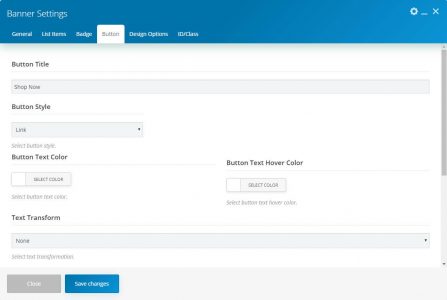
| Button (This tab only visible if “Banner Link” is unchecked.) | ||
| Button Title | Enter the button title. | |
| Button Style | Select the button style. There are three styles, and each style contains specific parameters.
– Link |
|
| Button Text Color | Select the button text color. | |
| Button Text Hover Color | Select the button text hovers color. | |
| Button Style( Flat ) | ||
| Button Size | Select button size. | |
| Button Shape | Select the button shape. | |
| Button Background Color | Select the button background color. | |
| Button Hover Background Color | Select the button hovers background color. | |
| Button Style( Border ) | ||
| Button Size | Select button size. | |
| Button Shape | Select the button shape. | |
| Button Border Color | Select the button border color. | |
| Button Border Width | Enter/select button border width. | |
| Text Transform | Select the text transformation style. | |
| Letter Spacing | Enter letter spacing. | |
| Line Height | Enter line-height. If you want to add value in decimal, then use a complete decimal format like allowed units are px, em, and %. | |
| URL | Set a button link here. | |
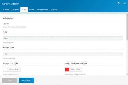
| Badge (This tab only visible if style-1 is selected) | ||
| Add Badge | Select this checkbox to add a badge. | |
| Title | Enter the badge title. | |
| Badge Type | Select the badge style. | |
| Badge Text Color | Select badge Text Color. | |
| Badge Type ( Border ) | ||
| Badge Border Color | Select the badge border color. | |
| Badge Type ( Flat ) | ||
| Badge Background Color | Select badge background color. | |
| Badge Vertical Align | Select badge vertical position. | |
| Badge Horizontal Align | Select a badge horizontal position. | |
| Badge Width | Enter badge width. | |
| Badge Height | Enter badge height. | |
| Badge Font Size | Enter a font size. | |
| Badge Line Height | Enter line-height. | |
| Badge Font Weight | Select font-weight. | |
| Badge Text Transform | Select the text-transform. | |
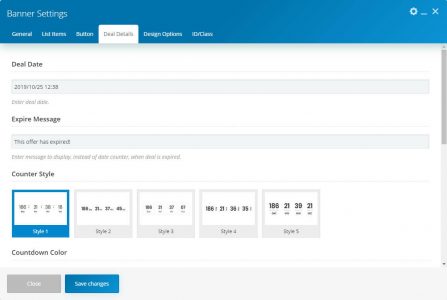
| Deal Details (This section only visible if deal-1 or deal-2 selected as banner style.) | ||
| Deal Date | Select / Enter deal date. | |
| Expire Message | Enter a message to display, instead of date counter, when the deal is expired. | |
| Counter Style | Select the deal counter style. | |
| Countdown Color | You can set the Color scheme. | |
| Deal Padding | You can set the padding here. | |

