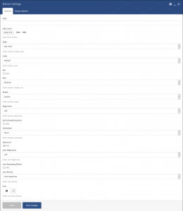
Button

This element allows to insert button.
| Param Name | Description | |
|---|---|---|
| Title | Enter button title. | |
| URL | Choose/add button link. | |
| Style | Choose button style. | |
| 3d? | Select this checkbox to enable 3d style. Note:This field will be applicable only if Default or Flat Color style is selected. | |
| Size | Select button shape. | |
| Shape | Select button shape. | |
| Alignment | Select button alignment. | |
| Set full width button? | Select this checkbox to set button size to full-width. Note:This field will be applicable if Alignment field is set to Left, Right or Center. | |
| Animation | Select button animation. | |
| Color | Select button color. Note:This field will be applicable only if Flat Color style is selected. | |
| Add icon? | Select this checkbox to set button icon. | |
| Icon Alignment | Select icon alignment. | |
| Icon Revealing Effect? | Select this checkbox to enable icon revealing effect. | |
| Icon Library | Select icon library. With Visual Composer you can easily add icons from following libraries: – Font Awesome – Open Iconic – Typicons – Entypo – Linecons – Mono Social – Material – Pixel – Flaticons | |
| Icon | Select icon from selected library. | |
| Shape | Select icon shape. | |

